Wellframe

Redesigning a digital health platform to increase patient retention and improve health outcomes.

Redesigning a digital health platform to increase patient retention and improve health outcomes.

What this case study showcases:

Information Design, Industry Experience, UI/UX Feature Redesign

Project Date:

November 2022

Tools:

Sketch

WELLFRAME'S MISSION

Wellframe provides digital care management solutions to improve health outcomes for high-risk patients.

Wellframe has two key user groups: 

  • High-risk patients 

  • Care managers working for insurance companies who help high-risk patients with their health and treatment goals. 

Care managers use Wellframe's desktop platform to communicate with patients who are using Wellframe's app and set reminders for medications and health tasks.

MY ROLE

This was one of several projects I worked on during my six months as a Product Design Co-op at Wellframe. For this assignment, I analyzed existing workflows, designed new features, and presented the proposed feature changes to Senior Product Managers and Designers, before turning them into Jira tickets for engineers.

THE CHALLENGE

Through research, we discovered that care managers found the differing workflows for managing Medication Reminders and General (also referred to as Member) Reminders confusing. Despite serving almost identical purposes and residing under the same tab on Wellframe’s website, the workflows to create, edit, delete and restart the two kinds of reminders were designed with different functionality, affordances, and inconsistent visual language.

As a result, care managers set up reminders less frequently, reducing opportunities to engage patients and support their health management. This had a broader implication for the health of their high-risk patients as adhering to health programs can significantly improve health outcomes, reducing the likelihood of hospitalization and other negative consequences.

Key Challenges:

  1. Different affordances & functionality between:

    • Medication

    • General Reminders.

  2. Inconsistent visual hierarchy

  3. Bugs

CARE MANAGER VIEW, BEFORE
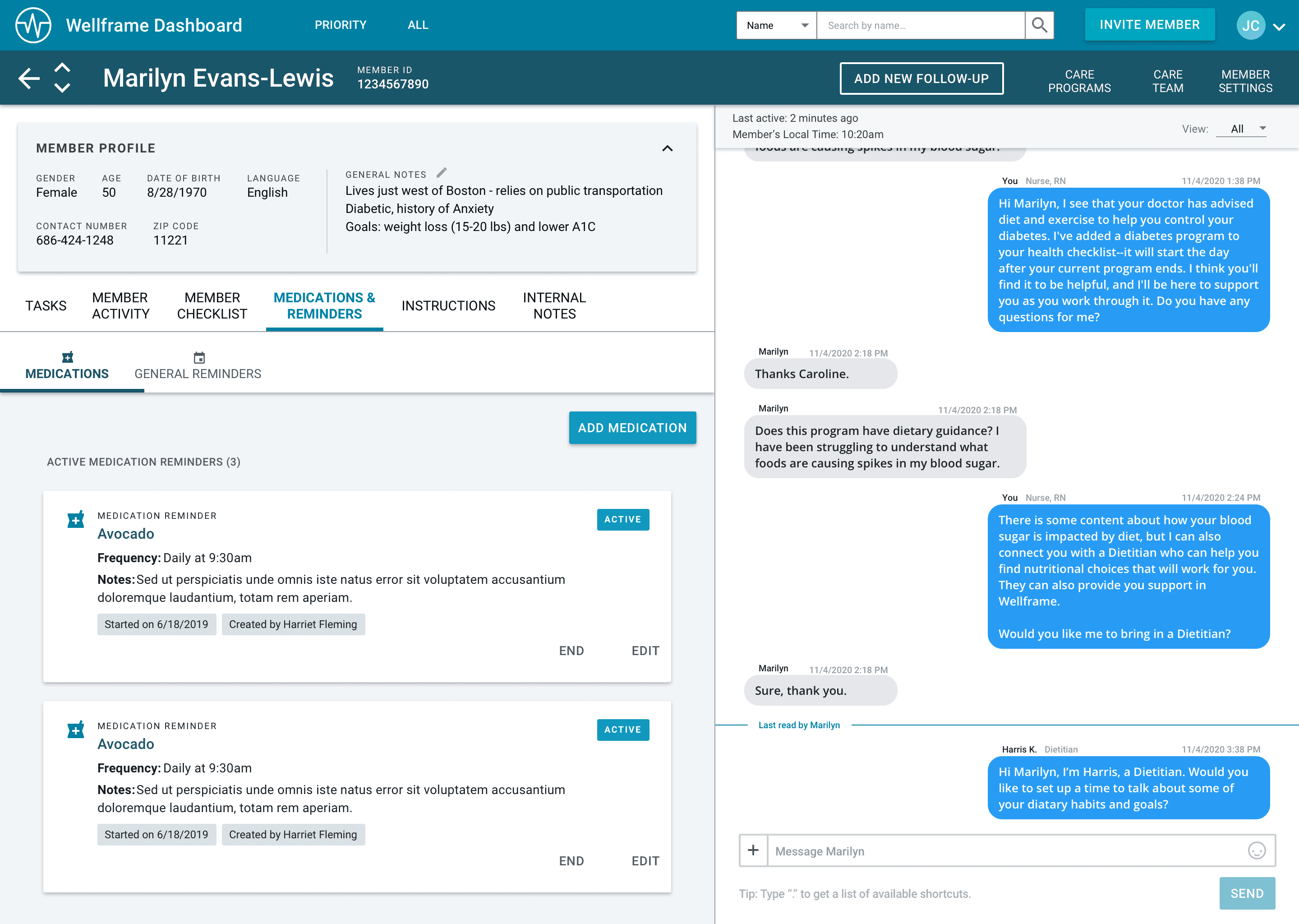
SOME OF THE ISSUES WITH ACTIVE REMINDERS - BEFORE


THE SOLUTION

To address these challenges, I focused on creating consistency across workflows, improving visual clarity, and generally identifying quick wins that could be handed off to engineers for fast implementation without overhauling the entire design system.

KEY CHANGES
  1. Standardized Workflows for Medication and General Reminders


  • Consistency in Reminder Creation: I streamlined the creation process by making both Medication and General Reminder workflows follow a similar flow. This eliminated confusion about where and how reminders should be set. For instance, creating a new Medication Reminder, which was previously an in-line process, was updated to match the flow of creating a General Reminder, making the experience uniform.


  • Unified Task Management: Both reminder types now feature the same steps for setting start dates and frequencies. This removes the confusion around different terminologies (e.g., "One Time" for Medications vs. "No Repeat" for General Reminders), providing clarity and reducing the likelihood of mistakes.


  1. Improved Visual Hierarchy


  • Clear Visual Cues: I adjusted the design to ensure that actionable buttons like “Edit,” “End,” and “Restart” were easy to find and consistent across reminder types. This included changes such as making the “End” button accessible for both types of reminders without having to go through multiple steps.


  • Tags for Dates: The redesign included standardizing how start and end dates are displayed on both types of reminders. This simple yet crucial change provided better clarity for care managers when reviewing a reminder’s timeline.


  • Active Status Clarification: The notes section, previously confusing because it showed up even when no notes were available, was redesigned to appear only when relevant. Similarly, the confusing status colors (“Active,” “Ending,” “Ended”) were updated to look distinct from action buttons to avoid further confusion.


  1. Documenting Bugs and Fixes


  • Bug Fixes: A major pain point was the non-functional “Restart” button for Medication Reminders. This was documented and flagged as a high-priority issue for the engineering team. 

THE OUTCOME

By addressing inconsistencies in the reminder creation process and making the interface more intuitive, the redesigned workflows enabled care managers to create more reminders efficiently, without errors. This increased the likelihood of patients receiving regular notifications, ultimately strengthening their engagement with their care programs. Taking a quick-win approach ensured these improvements were delivered rapidly without disrupting the overall design of the platform.

This case study demonstrates how even small design changes can have a significant impact on health outcomes for patients who need the greatest care.